Tassa brand strategy and design
A teether designed around the gesture babies copy most: holding a drink
Branding
Strategy
A small baby product company was preparing to launch a natural rubber teether.
Manufacturing and safety were already solved, but the product felt interchangeable with many others on the market.
They asked me to build a brand around it and help define why a parent would choose it in the first place.
Understanding the problem
Parents don’t struggle to find teethers. They struggle to get babies to actually use them.
Most are introduced when the baby is already crying.
At that moment the object is unfamiliar, so it gets rejected and replaced by another one. Over time parents collect several, hoping one will work.
So the issue wasn’t relief.
It was acceptance.
While observing daily routines one behaviour kept repeating.
Whenever an adult held a drink, the baby tried to participate. Not the liquid itself, just the action. Holding, lifting, mouth, pause.
At the same age babies are also chewing constantly because of teething discomfort.
Same movement, different reason.
But they happened in completely separate contexts.
Strategic direction
Instead of improving the teether as an isolated object, we worked on when it appears in the baby’s day.
The product would live inside an existing daily ritual.
The parent drinks, the baby chews.
By learning the object during calm repeated moments, the baby recognises it before discomfort starts.
Relief becomes something they initiate rather than something repeatedly offered.
This defined the positioning:
a teether learned through imitation
The goal was predictability rather than stimulation.
Naming
The brand needed to feel part of everyday life, not part of a toy category.
Tassa means cup in Catalan, the word naturally used at home in Barcelona.
Using a familiar domestic word removes the need to explain the behaviour and helps the object feel integrated into normal routines.
Product design
The form references a cup without becoming a miniature replica.
The intention was enabling the hand to mouth pause from any angle rather than copying a real object.
A continuous loop guides the grasping movement babies were already performing.
Natural rubber keeps the surface matte and warm so it can sit on a table next to real cups without looking like a toy.
Warm neutral tones allow it to coexist with adult objects instead of standing apart from them.
The object belongs to the room, not to the playmat.
Visual identity
Logo
The logo is based on the same idea as the product, a familiar object interpreted softly.
The curved baseline suggests the rim of a cup and subtly echoes a smile during use.
The letters remain friendly but not childish so the mark behaves more like a small household brand than a toy brand.
It sits comfortably on packaging and in adult environments.
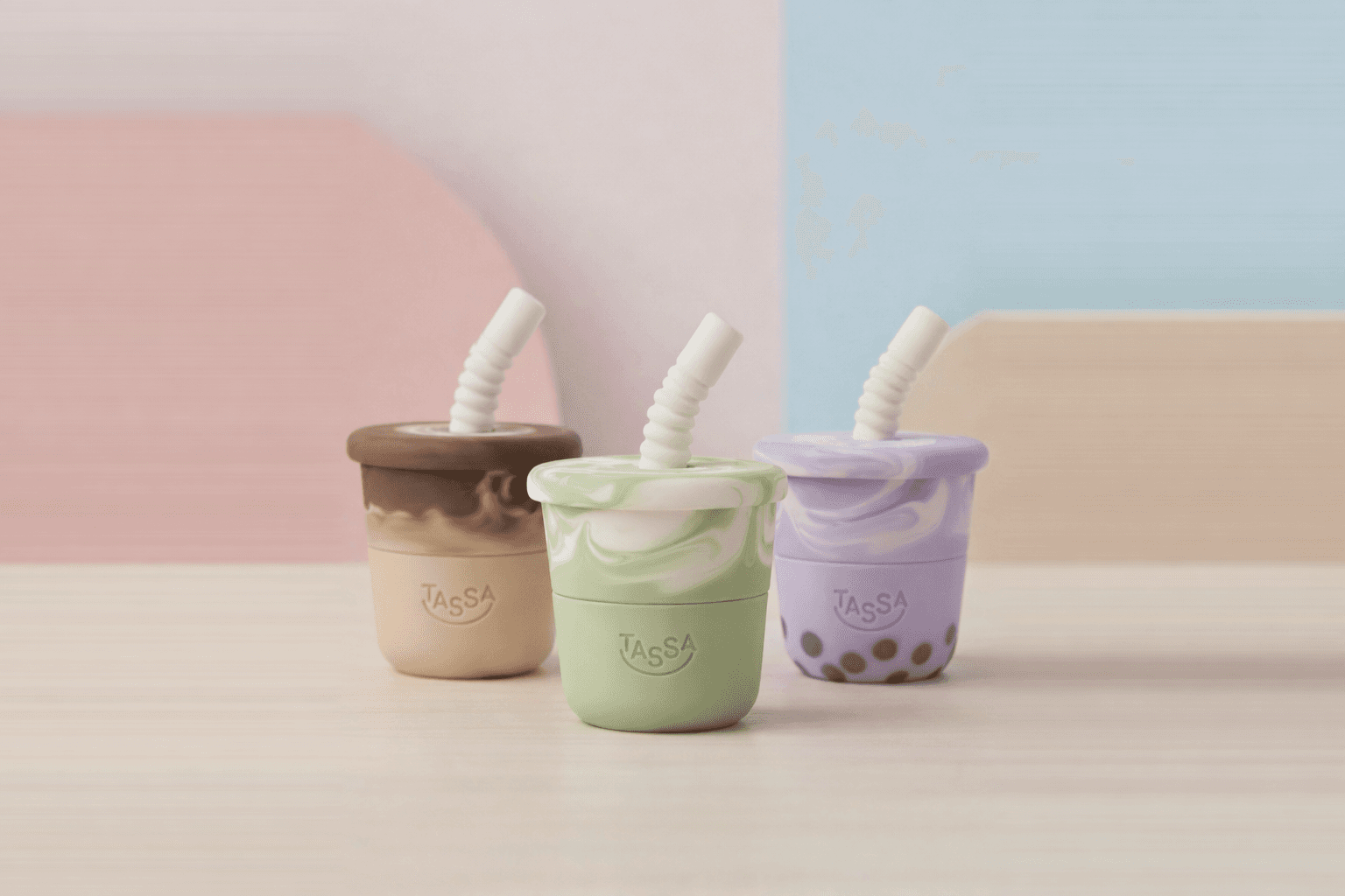
Colour palette
The palette comes from the drinks babies constantly see adults holding.
Mocca
Matcha
Taro bubble tea
Rather than applying branding colours onto the product, the brand borrows tones that already exist in the shared environment.
This reinforces recognition before interaction.
Avoiding bright nursery colours keeps the product calm and domestic.
The brand extends the moment instead of decorating it.
Communication
Communication focuses on recognisable situations rather than product claims.
Parent drinks
baby chews
The behaviour explains the product without instructions.
Photography follows real daily pacing so the object feels familiar immediately.
Result
The product gained a role in a routine rather than competing as another option in a category.
Parents no longer need to guess when to introduce it because the moment already exists in their day.
By attaching teething relief to a repeated action, the object becomes predictable and easier to accept.
The differentiation comes from behaviour and timing, not additional features.